Local
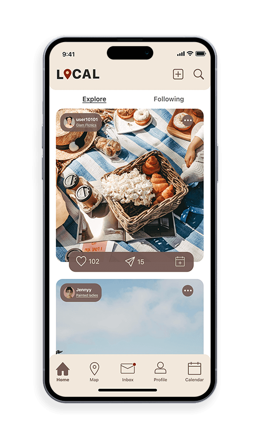
Designed and developed a mobile app that enables users to explore their local neighborhoods. I aimed to enhance the user experience and provide a seamless way for individuals to discover their local area.
Client:
Local
Role:
Solo Designer
Year:
2022

The Challenge
Lack of activities on your radar
This idea originated from my friends and I growing up in the same town our whole lives and feeling like we had exhausted all of our options for exploration in our area. We sat around often saying “there was nothing to do” while seeing our peers doing things we’d never done before wondering how they found out about an experience and we didn't. This frustration grew into my early 20s when I felt like I needed to leave the area I was in to do something new when I slowly realized that I was not looking in the right place. While I had several different apps to search for experiences near me, I didn’t have a way to document the information I had discovered.
The Solution
Know your neighborhood

1. Look at your options:
Increase your chances of attending new events due to personalized media
Always know all the details of what you are signing up for
Like, Share, and add posts to your calendar from the homepage
2. Communicate:
Track your personal insights of who follows/unfollows you along with liking your post
Compose and view messages from mutual followers
View short-term stories that are posted by all the users you follow


3. Stay Organized:
Be able to manage all your events on your calendar
Send your events to mutual followers
Search and add any personal events
Secondary research
Experience vs. Material
To start off my secondary research I began to read on topics of people stuck in routines and wanting more experiences when I came upon a shocking study done by Eventbrite:
“When it comes to money, ‘experiences’ trump ‘things’: More than 3 in 4 millennials (78%) would choose to spend money on a desirable experience or event over buying something desirable, and 55% of millennials say they’re spending more on events and live experiences than ever before.”
Competitive analysis + Problem statement
The competition is not specific
While keeping the statistic above in mind, I also know that social media platforms are becoming the younger generation's primary search engine. Keeping this in mind I found that none of these popular platforms are not targeting each person's specific interests within their radius while also allowing them to keep track of what they are attending.


Yelp
This led me to my problem statement:
People are finding out about nearby experiences by cross-checking several social media platforms, word of mouth, and stumbling into things accidentally. People need an easy way to browse local and authentic experiences near them without having to search several social media platforms. This ultimately leads to the question:
How Might We.. make the search for an experience just as exciting as the destination?
Screener surveys + Interviews
Approaching my target audience
Though from my secondary research it was evident that Millennials and younger generations value experiences over materialistic things, I still went ahead and sent out a screener survey to 20 potential users to see which 5 would be ideal to interview for the Local app.
Research questions:
Tell me more about the last time that you wanted to try something new?
How often would you say that you are actively seeking out something new?
Where do you get your best ideas from for a day/night out?
What about a good photo opportunity motivates you to want to go somewhere new?
Major insights
User pain points
User needs
Finding out about events as they are happening or when they are over
Having to travel over 45 minutes for something fun
Flipping through multiple different platforms
Would like to be notified about upcoming events
Know a good photo opportunity
Be able to organize all their social events in one place
Persona
Who is the user?
After conducting successful interviews it was clear at this point what my persona was.

Sketch
Design
I began exploring how I wanted the platform to look through sketches. Instagram was a great example for me because of its ease of discovery and content creation.
Through the design process, I used Instagram’s homepage and profile as inspiration. Nonetheless, I wanted to bring a fresh take on the design. These are a few screens that were developed at the time:

Rough drafts
Wireframes

Home

Inbox

Profil

Calendar
Testing + Improvements
Design Iterations
In the early design stage, I found myself wireframing and sketching ideas that were very similar to Instagram. Though I was using the platform as inspiration, it was clear that I needed to make Local’s home page, profile, and inbox unique. After reviewing the wireframes, I decided to come up with several different iterations of these screens to see which was the best fit.


Round the edges
Round all the edges
Add username and icon photo overlaid on the photo rather than the top
Finding fresh ways to add the like, share and calendar features


Normal grids are boring!
Create a hierarchy by changing up the 3 x 3 grid
Playing with the alignment of the main page
Adding options to edit profiles and view insights on each post
Final design
The final product


The style guide

Conclusions + lessons learned
What I'd do differently next time
This was my first UX project and I am so grateful to have been able to through an entire UX process! With this being said here are a few things that I learned:
Make as many versions as you can think of. After looking at my first wireframe in color I quickly realized that it was nothing like I had envisioned Local to look like. With that, I took back to the artboard to start from scratch. I essentially “redid” all iterations of my screens over 5 times, till I felt as if everything was carefully curated with a close eye.
Don't be afraid to ask for an extra pair of eyes. This was not always the easiest thing for me during this process. Since I had been looking at the files for a long time often it was difficult for me to see some obvious errors. I had friends and family usability tests as often as I could, to see what they were stumbling over or had questions about.
All in all, throughout this process, I feel like I created a product that would be widely used and appreciated. The feedback that I received from my mentor, peers, and industry professionals brought this idea to life. I really learned to trust the process and allow every assignment to shape my project into something that can actually be used.
Full Case Study
Figma Work File